Visualizing Earthquake Data
Source:vignettes/visualizing-earthquakes.Rmd
visualizing-earthquakes.RmdThis vignette shows common ways to explore and visualize earthquake
data retrieved with eqr. We’ll use tmap for
maps and ggplot2 for statistical summaries.
Fetch the data
library(eqr)
library(dplyr)
library(sf)
library(tmap)
library(ggplot2)

# 30 days of M2.5+ events, global
quakes <- get_quakes(
  start_time = Sys.time() - 30 * 86400,
  end_time   = Sys.time(),
  min_mag    = 2.5
)
Convert the time column (milliseconds since epoch) to a
proper POSIXct for plotting:
quakes <- quakes |>
  mutate(datetime = as.POSIXct(time / 1000, origin = "1970-01-01", tz = "UTC"))
Static map
tmap_mode("plot") produces a static map.
tm_bubbles() scales point size and colour by data columns
directly.
tmap_mode("plot")

tm_shape(quakes) +
  tm_bubbles(
    size   = "mag",
    fill   = "depth",
    fill.scale  = tm_scale_continuous(values = "viridis"),
    fill.legend = tm_legend(title = "Depth (km)"),
    size.legend = tm_legend(title = "Magnitude"),
    alpha  = 0.7
  ) +
  tm_title("Recent M2.5+ Earthquakes — Global") +
  tm_credits("Source: USGS FDSN", position = c("right", "bottom"))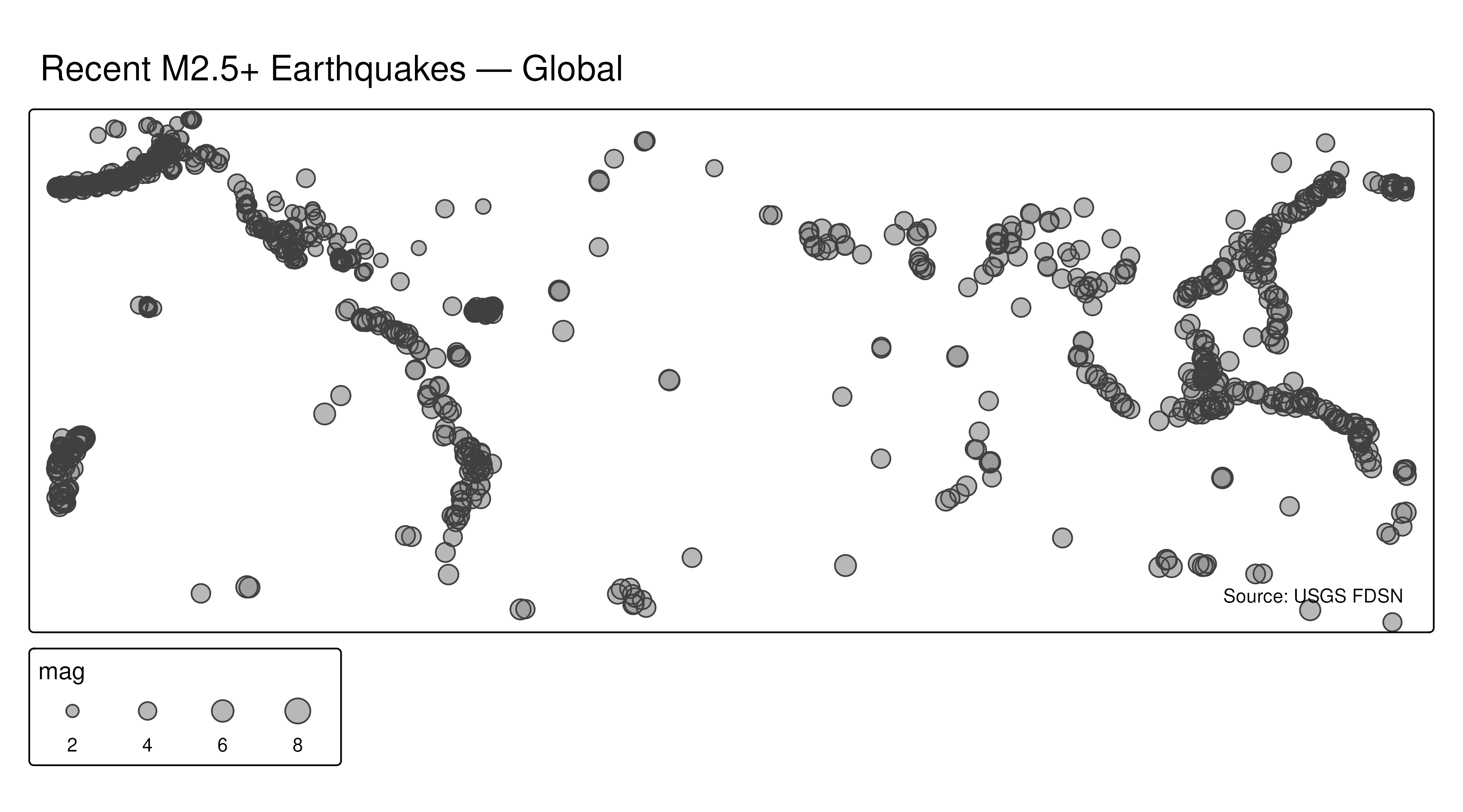
Add a basemap layer
tmap can pull tiles from a range of providers via
tm_basemap(), or you can layer polygon data. Here we add US
state borders from the spData package (ships with
tmap):
library(spData)  # provides us_states

us_states_proj <- sf::st_transform(us_states, 9311)
quakes_proj    <- sf::st_transform(quakes, 9311)

tm_shape(us_states_proj) +
  tm_polygons(fill = "grey95", col = "grey70", lwd = 0.4) +
tm_shape(quakes_proj) +
  tm_bubbles(
    size  = "mag",
    fill  = "depth",
    fill.scale  = tm_scale_continuous(values = "magma", n = 7),
    fill.legend = tm_legend(title = "Depth (km)"),
    size.legend = tm_legend(title = "Magnitude"),
    alpha = 0.7
  ) +
  tm_title("M2.5+ Earthquakes — Last 30 Days") +
  tm_credits("Source: USGS FDSN", position = c("right", "bottom"))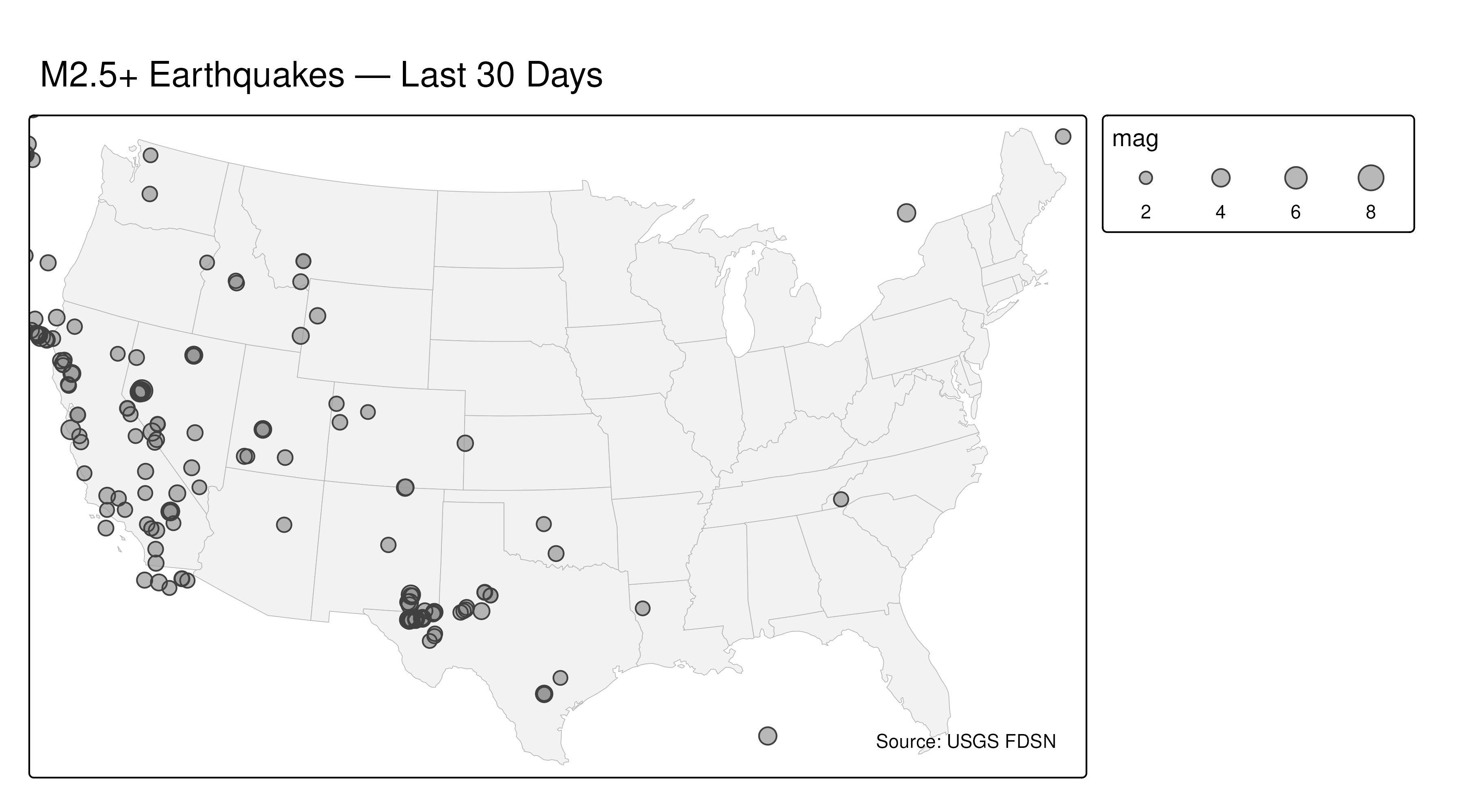
Interactive map
Switch to view mode with tmap_mode("view") to get a
pannable, zoomable leaflet-backed map — same tm_* code,
zero changes:
tmap_mode("view")

tm_shape(quakes) +
  tm_bubbles(
    size  = "mag",
    fill  = "depth",
    fill.scale  = tm_scale_continuous(values = "magma"),
    fill.legend = tm_legend(title = "Depth (km)"),
    size.legend = tm_legend(title = "Magnitude"),
    alpha = 0.6,
    id    = "place",                       # tooltip on hover
    popup.vars = c("mag", "depth", "place", "datetime")
  ) +
  tm_basemap("CartoDB.Positron")
Switch back to plot mode when done:
tmap_mode("plot")Magnitude distribution
ggplot(quakes, aes(x = mag)) +
  geom_histogram(binwidth = 0.1, fill = "steelblue", colour = "white") +
  scale_x_continuous(breaks = seq(2, 10, 0.5)) +
  labs(x = "Magnitude", y = "Count", title = "Magnitude Distribution") +
  theme_minimal()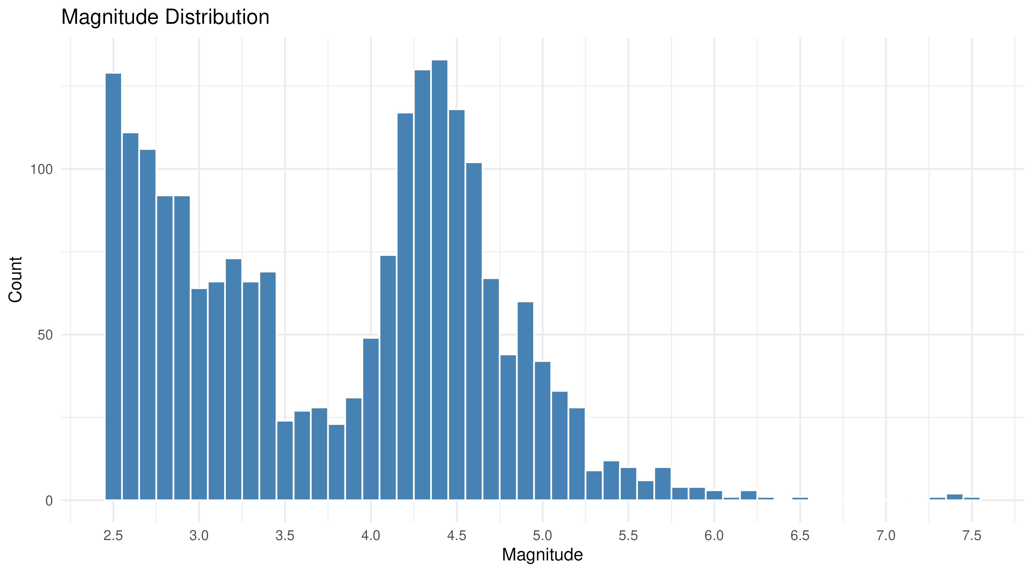
Earthquake frequency follows the Gutenberg–Richter law: each unit increase in magnitude corresponds to roughly 10× fewer events. A log-scale y-axis makes this linear relationship visible:
ggplot(quakes, aes(x = mag)) +
  geom_histogram(binwidth = 0.1, fill = "steelblue", colour = "white") +
  scale_y_log10() +
  labs(
    x = "Magnitude", y = "Count (log scale)",
    title = "Gutenberg–Richter Scaling"
  ) +
  theme_minimal()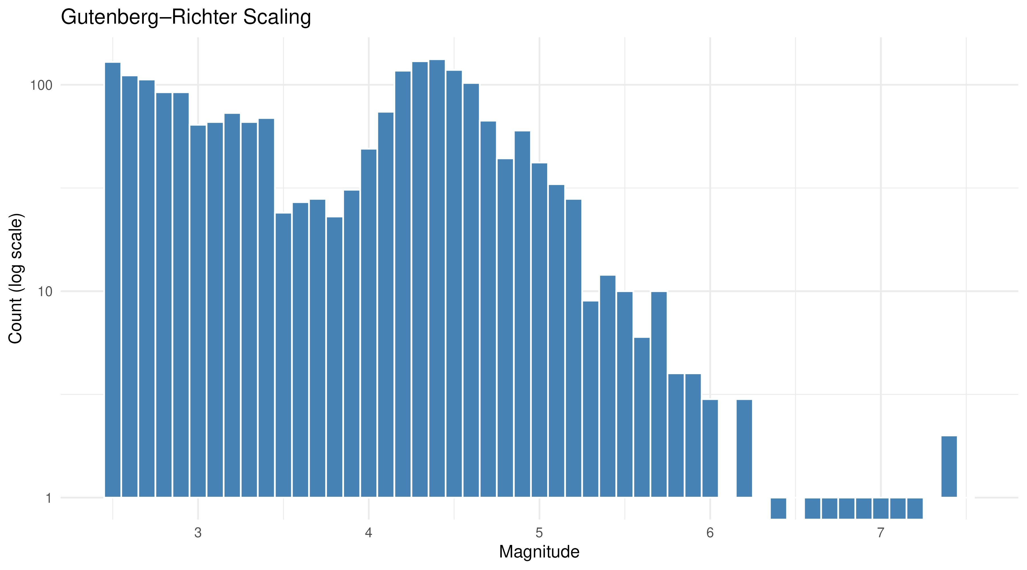
Events over time
daily <- quakes |>
  mutate(date = as.Date(datetime)) |>
  count(date)

ggplot(daily, aes(x = date, y = n)) +
  geom_col(fill = "steelblue") +
  labs(x = NULL, y = "Events per day", title = "Daily Earthquake Counts") +
  theme_minimal()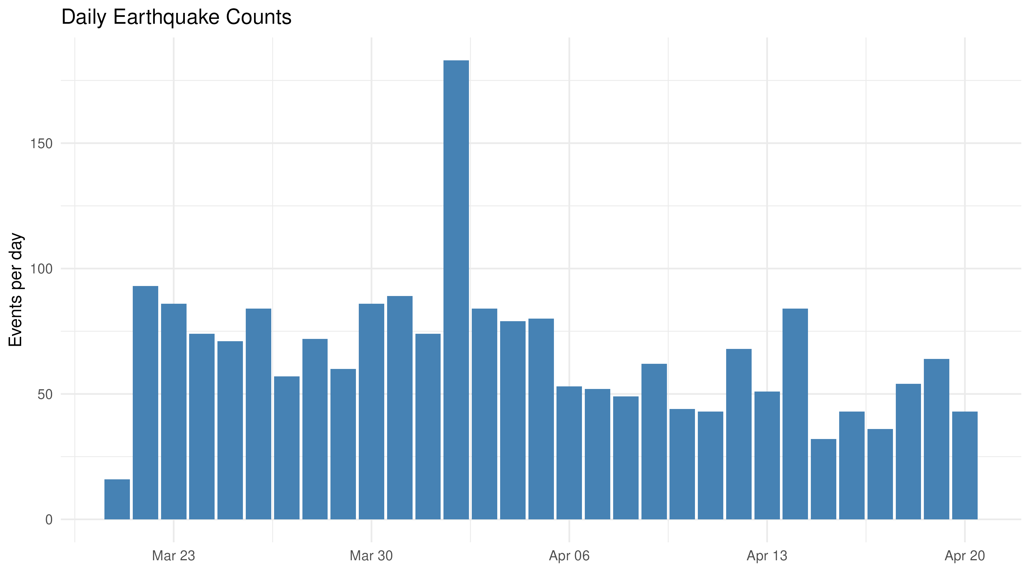
Depth vs. magnitude
ggplot(quakes, aes(x = depth, y = mag)) +
  geom_point(alpha = 0.3, size = 1) +
  geom_smooth(method = "loess", se = TRUE, colour = "firebrick") +
  labs(x = "Depth (km)", y = "Magnitude", title = "Depth vs. Magnitude") +
  theme_minimal()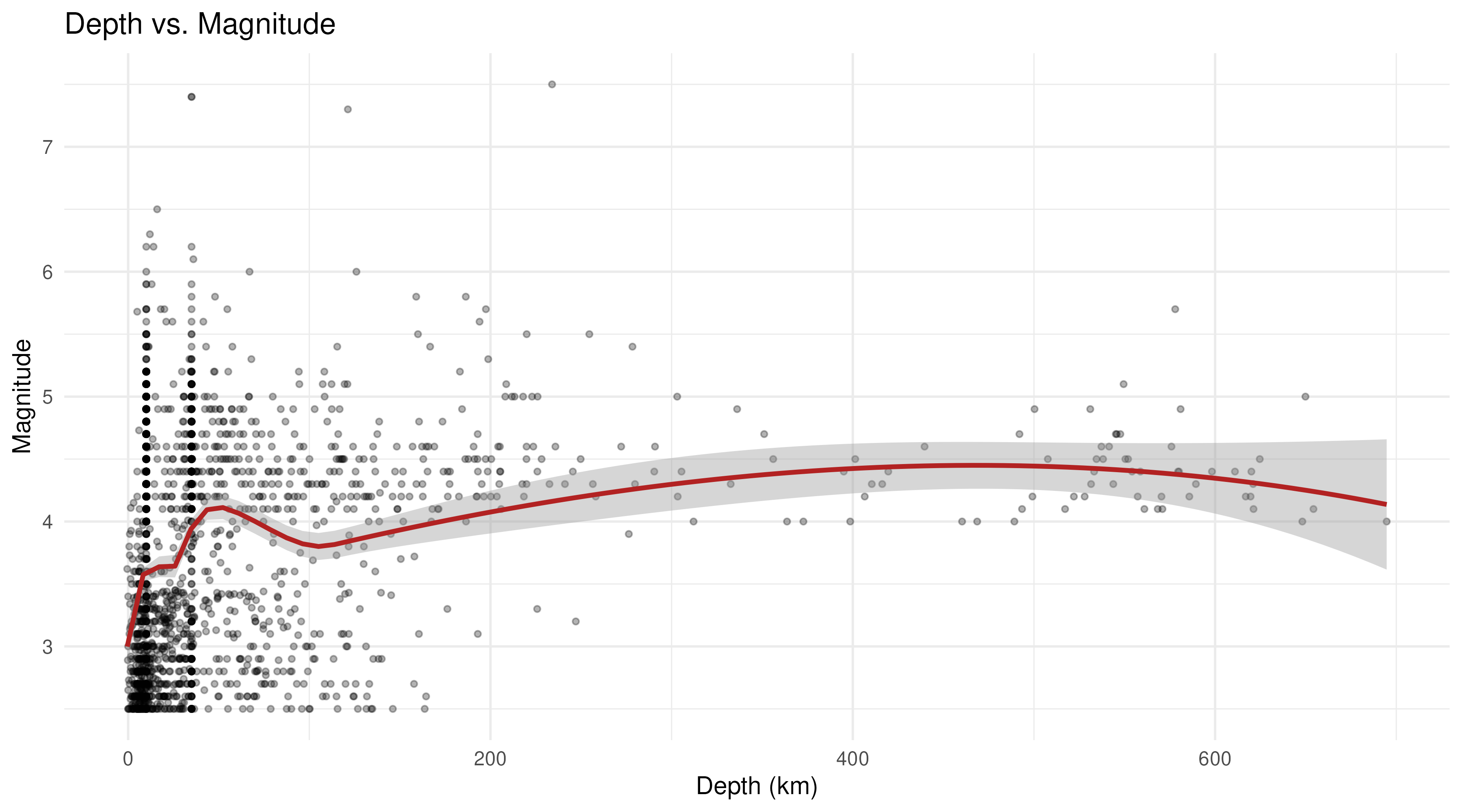
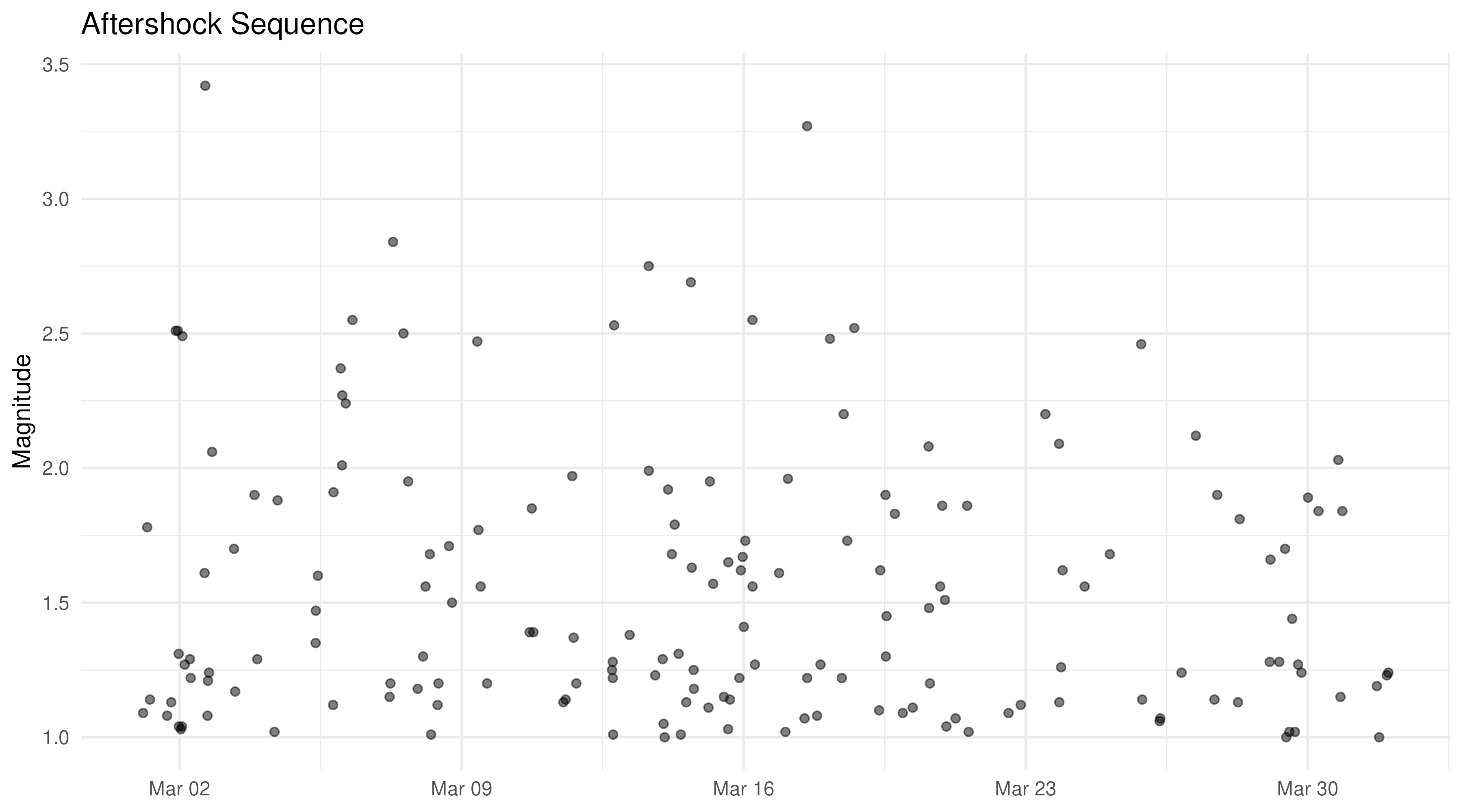
Focusing on aftershock sequences
After a large event, pull a tight spatial window around the epicenter to examine the aftershock sequence. The map shows the spatial spread; the scatter plot shows how activity decays over time.
# Example: events near a hypothetical M6.5 at (36.5N, 121.0W)
aftershocks <- get_quakes(
  start_time = "2026-03-01",
  end_time   = "2026-04-01",
  min_mag    = 1.0,
  min_lat    = 35.5, max_lat = 37.5,
  min_lng    = -122, max_lng = -120,
  order_by   = "time-asc"
)

aftershocks <- aftershocks |>
  mutate(datetime = as.POSIXct(time / 1000, origin = "1970-01-01", tz = "UTC"))
tmap_mode("view")

tm_shape(aftershocks) +
  tm_bubbles(
    size  = "mag",
    fill  = "datetime",
    fill.scale  = tm_scale_continuous(values = "plasma"),
    fill.legend = tm_legend(title = "Time"),
    alpha = 0.7,
    id    = "place",
    popup.vars = c("mag", "depth", "datetime")
  ) +
  tm_basemap("Esri.WorldTopoMap")
tmap_mode("plot")

ggplot(aftershocks, aes(x = datetime, y = mag)) +
  geom_point(alpha = 0.5) +
  labs(x = NULL, y = "Magnitude", title = "Aftershock Sequence") +
  theme_minimal()